A brand redesign can be a game-changer for a company. It’s an opportunity to refresh the brand’s image, stay relevant in a changing market, and better connect with the target audience. In this article, we’ll look at some successful brand redesigns, analyzing what made them effective and what lessons can be learned.
1. Airbnb: From Start-Up to Global Leader
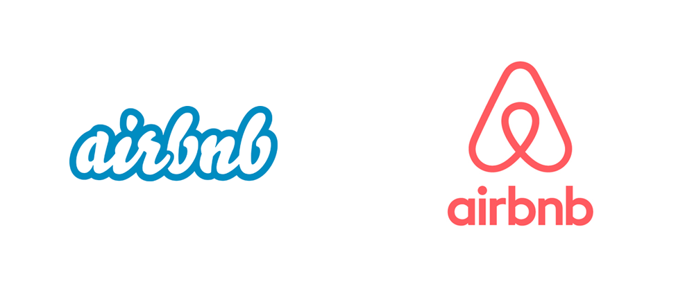
Before: Airbnb’s original logo was a simple wordmark with a playful, almost childlike, design. It didn’t reflect the brand’s growth and ambition.
After: In 2014, Airbnb introduced a new logo, called the “Bélo.” This symbol, resembling a heart, a location pin, and the letter “A”, represented “belonging.” The redesign included a more sophisticated typeface and a cohesive color palette, positioning Airbnb as a mature, global brand.

Why It Worked:
- Symbolism: The new logo encapsulated the company’s core message of belonging and community.
- Modernization: The updated design reflected Airbnb’s evolution from a start-up to a major player in the hospitality industry.
- Versatility: The new logo was versatile, working well across various applications, from app icons to billboards.
2. Apple: Minimalism at Its Best
Before: In 1976, Apple’s original logo featured a detailed illustration of Isaac Newton under an apple tree. This intricate design was soon replaced by the iconic rainbow apple logo, which was more recognizable but still complex.
After: In 1998, Apple simplified its logo to a monochromatic apple silhouette. This sleek, minimalist design has become one of the most recognizable logos in the world.

Why It Worked:
- Simplicity: The minimalist design is timeless and easy to reproduce across different media.
- Flexibility: The monochromatic logo adapts well to various colors and backgrounds.
- Modern Appeal: The clean design reflects Apple’s commitment to innovation and modern technology.
Want some cool stuff?
3. Pepsi: Embracing Change
Before: Pepsi’s logo has undergone numerous changes since its inception in the late 19th century. The most notable design before the 2008 redesign was the 1998 logo, which featured a three-dimensional globe with bold, dynamic typography.
After: In 2008, Pepsi introduced a more streamlined logo with a flatter design and a tilted globe that suggested a smile. The typography was modernized to be more approachable.

Why It Worked:
- Fresh Look: The simplified, flat design was modern and clean, appealing to contemporary tastes.
- Positive Imagery: The tilted globe resembling a smile added a friendly, approachable element to the brand.
- Brand Consistency: Despite the changes, the redesign retained key elements of the previous logos, maintaining brand recognition.

Brand Design – Part 2 – Brand Identity Development – EBOOK
4. Starbucks: Simplifying the Icon
Before: Starbucks’ logo has evolved from a complex, detailed illustration of a siren to a simpler, more modern design. The 1987 logo was a brown circle with the siren and the words “Starbucks Coffee.”
After: In 2011, Starbucks removed the wordmark and went with just the green siren. This bold move simplified the logo while making the siren more prominent.

Why It Worked:
- Simplicity: Removing the text streamlined the logo, making it cleaner and more modern.
- Brand Recognition: By focusing on the siren, Starbucks leveraged its strong brand recognition.
- Versatility: The simplified logo works well in various sizes and formats, from cups to billboards.
Want some cool stuff?
5. Microsoft: A Modern Makeover
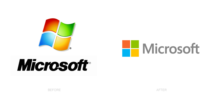
Before: Microsoft’s logo, before the 2012 redesign, was a bold, italicized wordmark that had been used for 25 years. It was starting to look outdated in a rapidly modernizing tech world.
After: In 2012, Microsoft unveiled a new logo featuring a simple, straight-lined typeface and a multi-colored square symbol. The new logo represented the company’s transition into a new era of technology and innovation.

Why It Worked:
- Modern Design: The new logo’s clean lines and modern typeface aligned with contemporary design trends.
- Symbolism: The multi-colored square represented Microsoft’s diverse product offerings.
- Professionalism: The new design gave the brand a professional and forward-thinking image.
Lessons Learned from Successful Redesigns
- Understand Your Brand’s Core Message:
- Every successful redesign starts with a clear understanding of the brand’s values and goals. This ensures that the new design aligns with the brand’s identity.
- Embrace Simplicity:
- Many successful redesigns involve simplifying the logo. A simple design is more versatile and easier to recognize.
- Stay True to Your Roots:
- While modernizing a logo, retaining some elements of the original design can help maintain brand recognition.
- Adapt to Changing Tastes:
- Design trends change, and brands need to evolve to stay relevant. Regularly updating your brand’s visual identity can help keep it fresh and appealing.
- Consider Versatility:
- A good logo works across various applications, from digital screens to physical products. Ensure your logo is versatile enough to adapt to different formats.
Want some cool stuff?
Conclusion
A successful brand redesign can rejuvenate a company’s image and strengthen its connection with its audience. By understanding your brand’s core message, embracing simplicity, and staying adaptable, you can create a logo that is both timeless and modern. These case studies demonstrate the power of thoughtful redesigns and offer valuable insights for any brand looking to refresh its visual identity.


0 Comments