Typography is a crucial element in graphic design. It’s not just about choosing pretty fonts; it’s about how you arrange type to make your design legible, visually appealing, and effective in conveying your message. Typography can be as simple or as complex as you make it, and mastering its use can elevate your designs to a professional level. This article will explore the basics, intermediate techniques, and advanced strategies in typography for graphic design.
Basics of Typography
Understanding the fundamentals of typography is essential for any designer. Here are the key concepts and terms you need to know:
1. Typefaces and Fonts:
- Typeface: A family of fonts (e.g., Arial, Times New Roman).
- Font: A specific style within a typeface (e.g., Arial Bold, Times New Roman Italic).
2. Serif vs. Sans-Serif:
- Serif: Typefaces with small lines at the ends of characters (e.g., Times New Roman).
- Sans-Serif: Typefaces without these lines (e.g., Helvetica).
3. Basic Terms:
- Kerning: Adjusting the space between individual characters.
- Leading: The space between lines of text.
- Tracking: Overall spacing between characters in a block of text.
4. Readability and Legibility:
- Readability: How easy it is to read long blocks of text.
- Legibility: How easily individual characters can be distinguished.
Want some cool stuff?
Intermediate Typography Techniques
Once you’re comfortable with the basics, you can start experimenting with more sophisticated techniques to enhance your designs.
1. Hierarchy: Creating a clear visual hierarchy helps guide the reader through your content. This can be achieved by varying:
- Size: Larger text for headings, smaller for body text.
- Weight: Using bold or light fonts to differentiate importance.
- Color: Different colors can highlight important text.
2. Pairing Typefaces: Combining different typefaces can add interest and depth to your design. Here are some tips for effective pairing:
- Contrast: Pair a serif with a sans-serif for a balanced look.
- Compatibility: Ensure the typefaces complement each other’s style.
- Limit Choices: Stick to two or three typefaces to avoid clutter.
3. Alignment and Spacing: Proper alignment and spacing create a clean, organized look.
- Alignment: Choose left, right, center, or justified alignment based on the design’s purpose.
- White Space: Use white space effectively to avoid a crowded layout.
4. Color and Contrast: Using color can enhance the emotional impact and readability of your text.
- High Contrast: Ensure there is enough contrast between text and background.
- Color Psychology: Use colors that align with the message you want to convey (e.g., blue for trust, red for urgency).
Advanced Typography Strategies
Advanced typography involves more complex techniques that require a deeper understanding of design principles and creative experimentation.
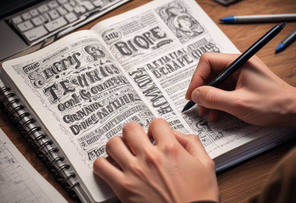
1. Custom Typography: Creating custom typefaces or hand-lettering can make your designs unique.
- Hand-Lettering: Adds a personal touch and can be highly expressive.
- Custom Fonts: Tailored to fit the specific needs and style of your project.
2. Variable Fonts: Variable fonts are a single font file that behaves like multiple fonts. They allow you to adjust weight, width, and other attributes dynamically.
- Flexibility: Great for responsive design, as they adapt to different screen sizes.
- Performance: More efficient than loading multiple font files.
3. Grid Systems: Using a grid system helps maintain consistency and alignment across your design.
- Modular Grids: Break the layout into consistent, repeatable units.
- Baseline Grids: Align all text elements to a common baseline for a cohesive look.
4. Experimental Typography: Pushing the boundaries of traditional typography can lead to innovative and striking designs.
- Breaking Rules: Sometimes, breaking typography rules can create a strong visual impact. This should be done purposefully and sparingly.
- Mixed Media: Combining typography with photography, illustration, or textures can create dynamic visuals.
Want some cool stuff?
Practical Applications
1. Web Design: Typography on the web needs to be adaptable and user-friendly.
- Responsive Typography: Adjust font sizes and line heights based on screen size.
- Web Fonts: Use web-safe fonts or services like Google Fonts to ensure consistency across browsers.
2. Print Design: Typography in print requires attention to detail to ensure clarity and impact.
- Resolution: Ensure text is clear at high resolutions (300 dpi for print).
- Bleed and Margins: Account for bleed and margins to avoid text being cut off.
3. Branding: Typography is a key component of a brand’s identity.
- Consistency: Use the same typefaces and styles across all brand materials.
- Voice: The typography should reflect the brand’s personality (e.g., formal, playful, modern).
Tips for Mastering Typography
- Study Great Designs: Analyze and learn from well-designed materials. Look at how they use typography to create hierarchy, balance, and interest.
- Practice: Experiment with different typefaces, sizes, and layouts. Practice makes perfect.
- Stay Updated: Typography trends evolve. Keep up with the latest trends and techniques to keep your designs fresh.
- Feedback: Seek feedback from peers and mentors. They can provide valuable insights and suggestions for improvement.
Conclusion
Typography is a fundamental aspect of graphic design that can greatly influence the effectiveness and aesthetics of your work. By mastering the basics, experimenting with intermediate techniques, and exploring advanced strategies, you can enhance your designs and communicate your message more effectively. Whether you’re designing for web, print, or branding, a strong understanding of typography will set your work apart and help you create compelling, professional designs.


0 Comments